When we think of name plates for the office, the focus often shifts to the material, size, or even the color scheme. However, one aspect that often gets sidelined but holds immense significance is the typography or fonts used on these name plates. Fonts are not just a design afterthought; they are integral to the effectiveness of your signage. The right choice can convey your brand message clearly and effectively. Door name plates are especially critical because they are the first point of contact with a person entering a space.
Setting the Tone: How Fonts Evoke Emotional Responses
Choosing the right font for your office name plates is akin to choosing the right attire for an event. Fonts evoke emotions and set the tone for your office environment. A modern, minimalist font may suggest efficiency and innovation, while a classic serif font may evoke trust and reliability.
Legibility and Readability: Crucial Factors in Font Selection
When it comes to personalized name plates for doors, legibility and readability are non-negotiable.
- Legibility refers to how easily individual letters or characters can be distinguished from each other.
- Readability refers to how well the design and layout facilitate ease in reading the text as a whole.
The choice of a font can either ease the process of identifying a place or person or complicate it, so be cautious.
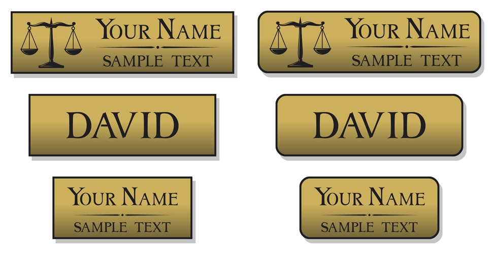
Typeface Categories: Serif, Sans-serif, and Script
Different industries often favor different categories of fonts for name plates for office use:
- Serif Fonts: These are generally used in more formal, corporate settings and signify tradition.
- Sans-serif Fonts: These are versatile and work well in tech companies, design studios, and more relaxed environments.
- Script Fonts: Reserved for creative industries, they are used sparingly due to readability concerns.
Industry Standards: Font Choices Across Different Sectors
From healthcare to academia to tech, each sector has its preferred fonts. However, consistency and alignment with your brand message are crucial. It’s essential to find a balance between industry norms and your brand’s unique identity when selecting fonts for personalized name plates for doors.
The Role of Size and Spacing: Maximizing Impact and Clarity
The font size and spacing also play a significant role in door name plates. Too small, and it defeats the purpose of identification. Too large, and it can appear overwhelming. The key is to strike a balance, ensuring that the name plate serves its function effectively.
Combining Typography and Design Elements
Combining fonts with other design elements like colors, borders, and logos can yield a cohesive and visually pleasing name plate. However, less is often more, and overcrowding should be avoided.
Compliance and Accessibility: Meeting ADA Requirements
Choosing fonts that comply with the Americans with Disabilities Act (ADA) is vital for ensuring accessibility. Fonts should be easy to read from a distance and not cause any visual strain.
Conclusion
Typography isn’t merely a design add-on; it’s an essential element in creating effective name plates for office doors. It impacts everything from the tone and feel of your office space to the ease with which visitors and staff can navigate it. For premium quality name plates that meet all these typography and design standards, look no further than Identifab Industries. With our expertise, you can create name plates that are not just visually appealing but are also effective and compliant with regulations.